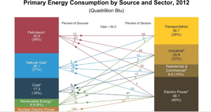
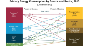
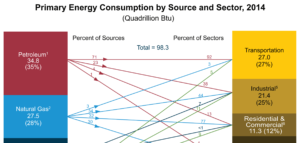
Energy Information Administration U.S. Primary Energy Consumption by Source and Sector Graphics
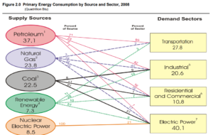
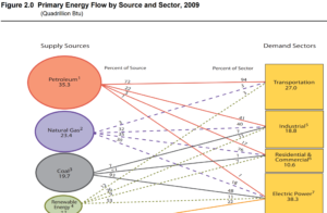
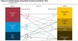
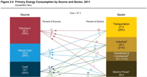
Graphics from the Energy Information Administration showing U.S. primary energy consumption by source and sector for each year from 2008-2017. The change over time lesson will engage your students to make sense of the data represented in the graphics and to track a particular trends and how they might be changing over time.
